The name Trellis Charts will not give a good insight of what exactly this does in OBIEE. Simply speaking these are charts in grids. That is graphs in table cells or pivot cells that display matrices of measures with each cell in the matrix containing a micro chart,
Let us now build a simple Trellis Chart, which allow you to select any graph type for each chart cell, the sales is shown by product category. Perform steps as below.
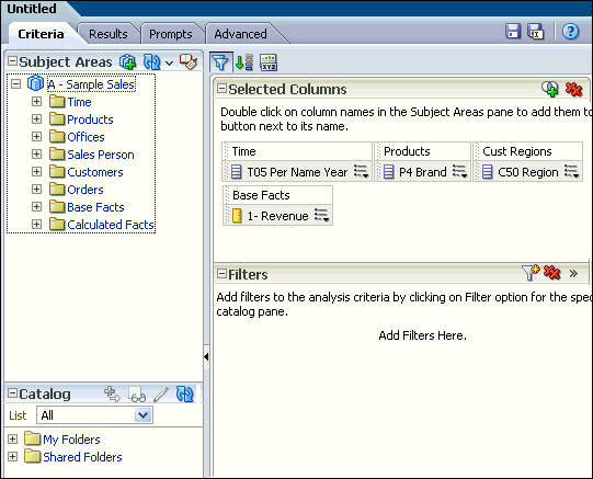
1.Create a new analysis, With 3 or 4 columns. I have taken the Sample Sales and added columns as shown below.
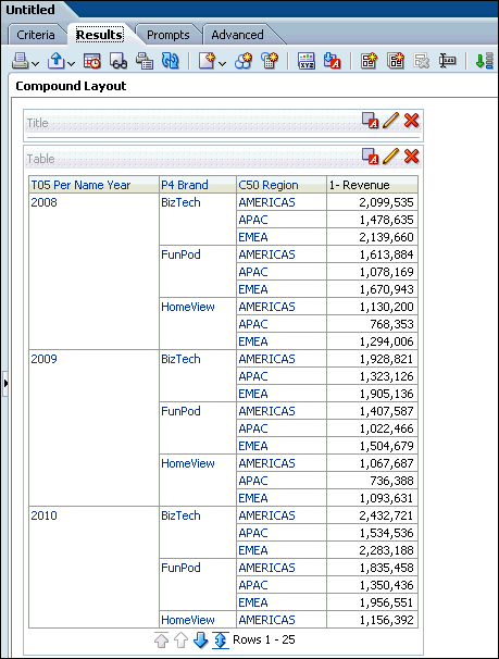
2.Go to Results tab by default we can see the table view as below.
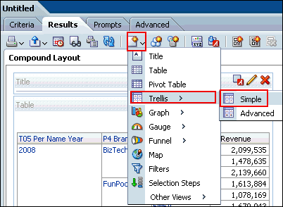
3. As always since we are looking for Trellis chart , add one from new view icon as show below. For now we will choose simple Trellis view.
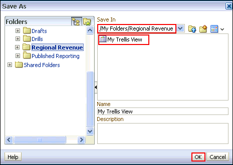
4. Save the analysis with some name, My case I am saving as My Trellis View
5. Click the Edit View icon of the Trellis view to go to the view adjustments. You can see the alignment difference from other views.
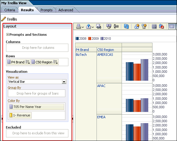
6.Arrange the measures and dimensions as required, for example refer below.
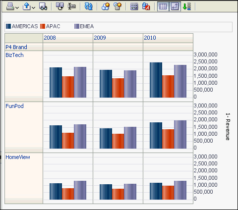
7. Now your Trellis view looks something like below. You can do several customizations as per your need.
Let us now build a simple Trellis Chart, which allow you to select any graph type for each chart cell, the sales is shown by product category. Perform steps as below.
1.Create a new analysis, With 3 or 4 columns. I have taken the Sample Sales and added columns as shown below.
2.Go to Results tab by default we can see the table view as below.
3. As always since we are looking for Trellis chart , add one from new view icon as show below. For now we will choose simple Trellis view.
4. Save the analysis with some name, My case I am saving as My Trellis View
5. Click the Edit View icon of the Trellis view to go to the view adjustments. You can see the alignment difference from other views.
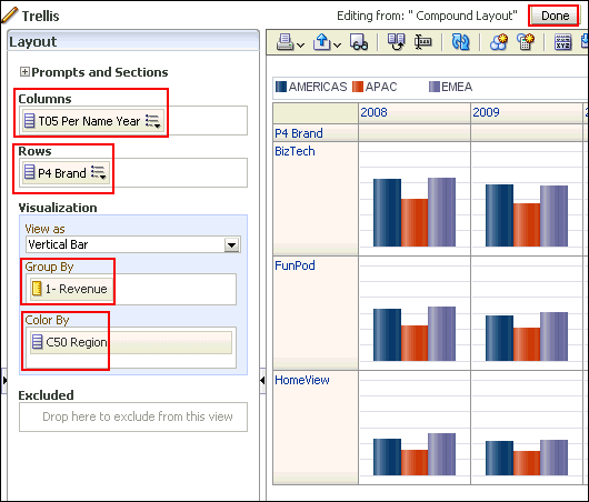
6.Arrange the measures and dimensions as required, for example refer below.
7. Now your Trellis view looks something like below. You can do several customizations as per your need.
This post is to get you familiarized with the Trellis views. You can play around to understand the complex views.
No comments:
Post a Comment